Marketing branding for a leading healthcare system.
The Partner
Naples Comprehensive Health (NCH) is an independent, non-profit healthcare system in Southwest Florida boldly pursuing their mission to help people live happier, healthier and longer lives. Through clinical advancements and visionary leadership, NCH is advancing steadily, and The Partnership’s branding campaign has further propelled the brand.
Opportunity
To capture this transformative period of time, The Partnership, a leading healthcare marketing agency in Naples and Southwest Florida initiated a comprehensive rebrand for the entire healthcare system, from research to execution in market. This case study reflects the identity design portion of the project.
Approach
Our Creative marketing team is all about asking great questions and engaging in dialogue between our Strategy and Account teams. They reviewed user personas, digested key research insights and got briefed on market positioning, value propositions and the new messaging of the healthcare system. So when it came to creating the new brand image, our creative team had considered all the ways the brand needed to communicate to its various audiences.
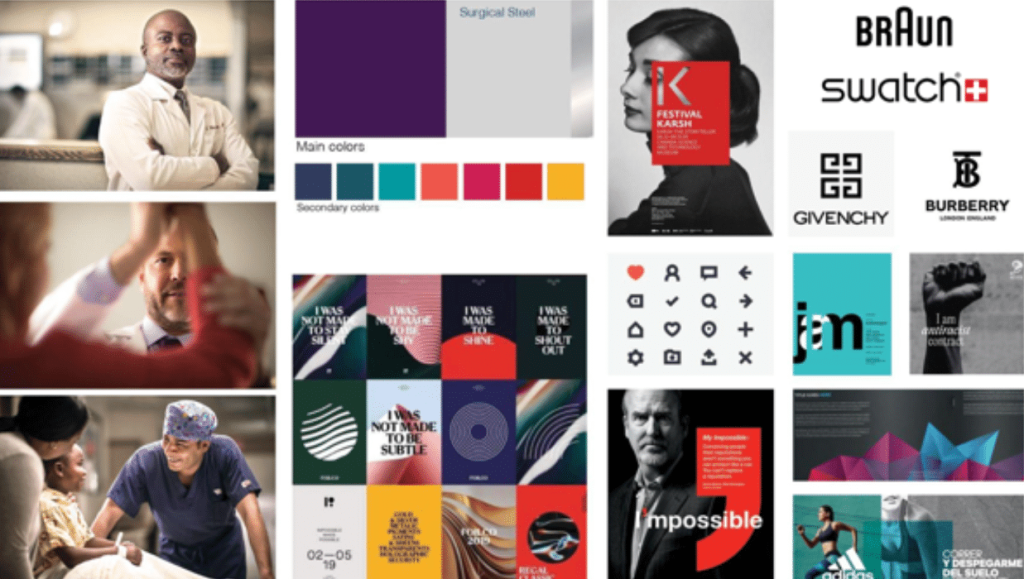
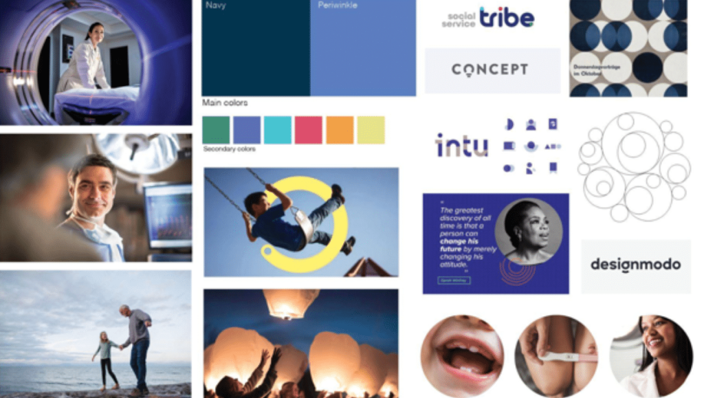
To define the design approach, mood boards were created to determine various visual design perspectives. They included a range of colors, patterns, textures, fonts, and images that could express NCH’s new brand personality. Final options were socialized with key constituents within the healthcare system from Board members to nurses to community organizers. Locking down a style direction was a critical milestone of our brand building.
Chosen Mood board: Bold
Mood Board 2: Full Circle Care
Refinement
With the chosen style set, the team decided on art direction and created logo concepts. The concepts were inspired by the new brand strategy of boldly leaning into the competency of a transforming healthcare system.
Multiple concepts from multiple designers were considered, critiqued and developed. Evaluation was within the lens of the new brand strategy. The concepts intentionally didn’t feature any visual triggers or prompts that are typical for a medical theme, instead focusing on a modern and minimal style.
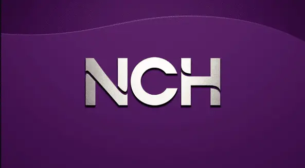
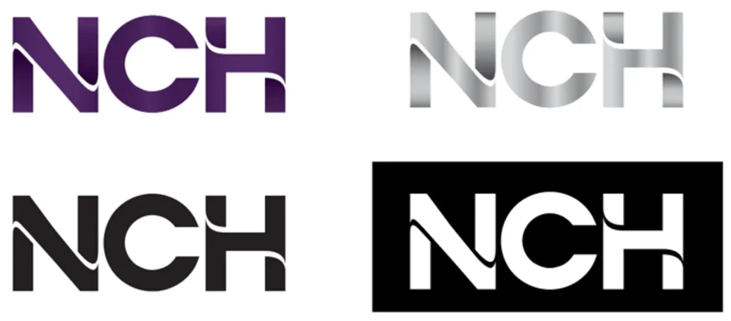
Our designer, Lindsay Muncy, created the winning option (and the crowd favorite). The Visionary Violet logo conveys the strong message of boldness, confidence and care. And the gradient adds depth and implies movement making the logo more dynamic. That movement is a wonderful nod to the original “swoosh” in the decades old logo.
NCH logo
Building a Brand System
With the logo lockup in place, the team created the entire brand system and guidelines. A microsite with logo usage, brand overview, templates was created for the general public to ensure brand consistency and enablement.
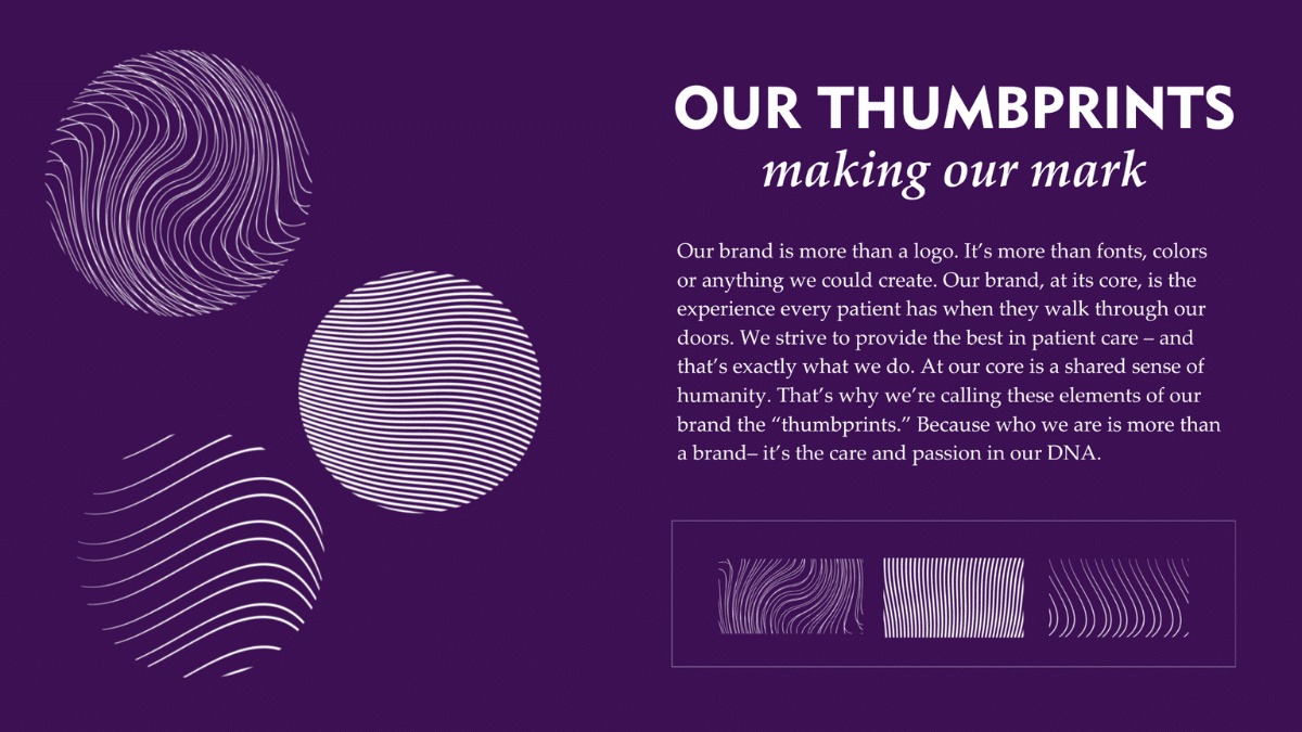
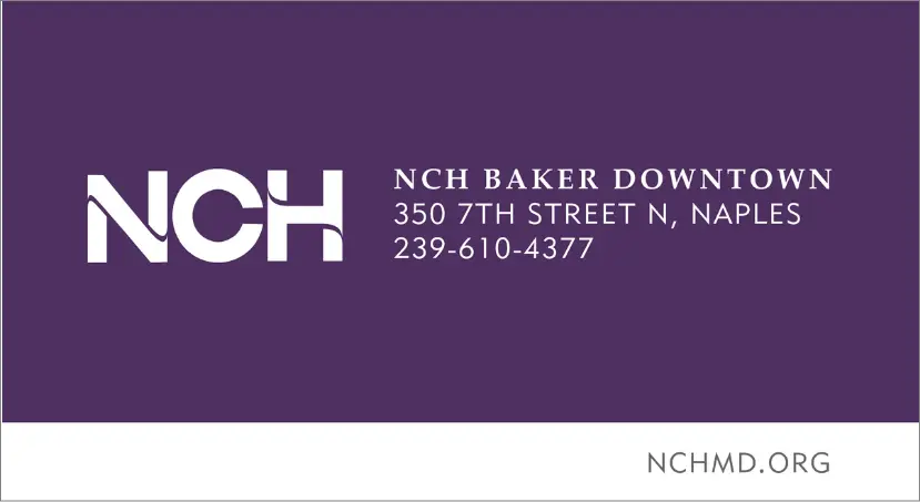
To increase the logo’s flexibility for different visual design goals, the design team developed a set of variations accommodating color, print, digital, physical signage, video and animated. A black-and-white version and variants for light and dark backgrounds are available. Graphical elements called “thumbprints” were created to express the shared sense of humanity in the brand and the patient care and passion in NCH’s DNA.
Graphic elements
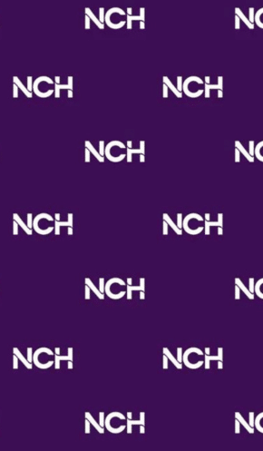
Step and repeat pattern
Logo lockup
E-mail banner
Impact
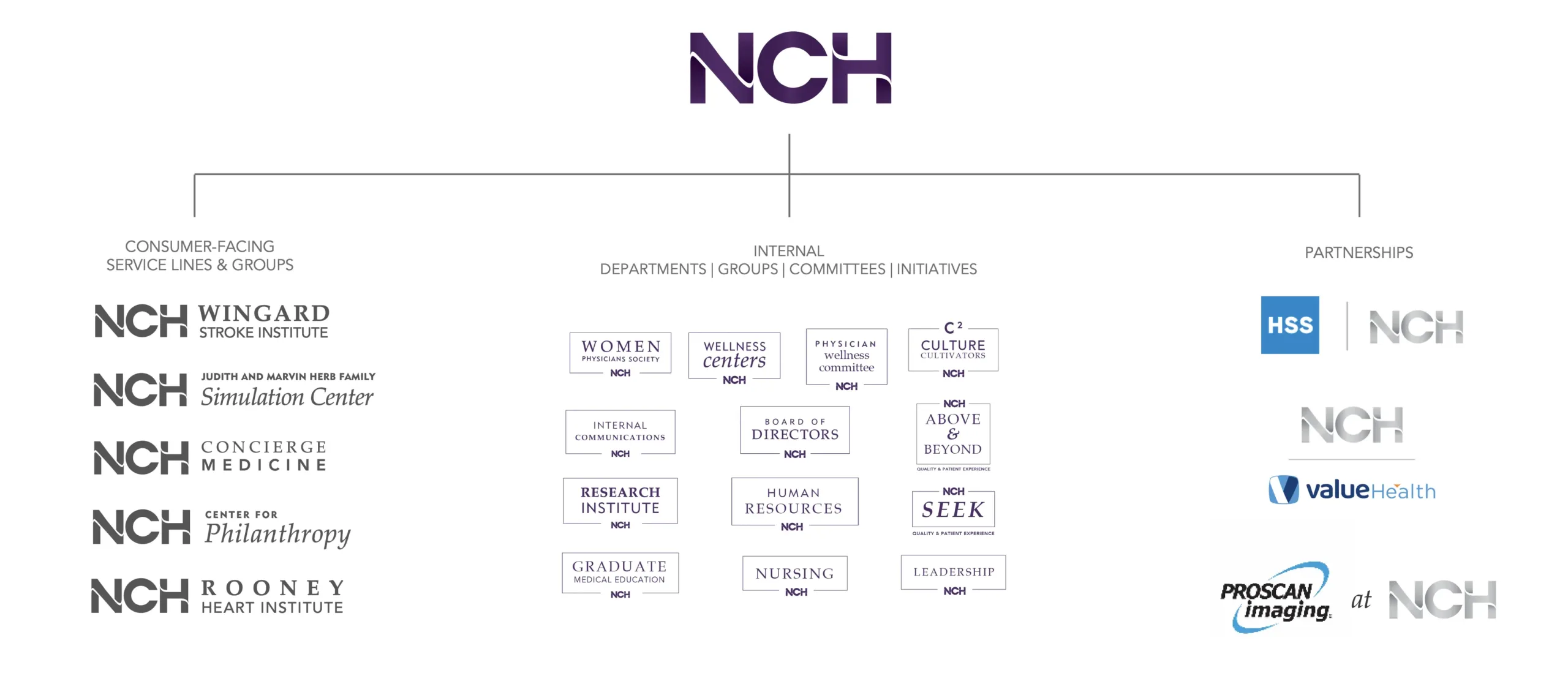
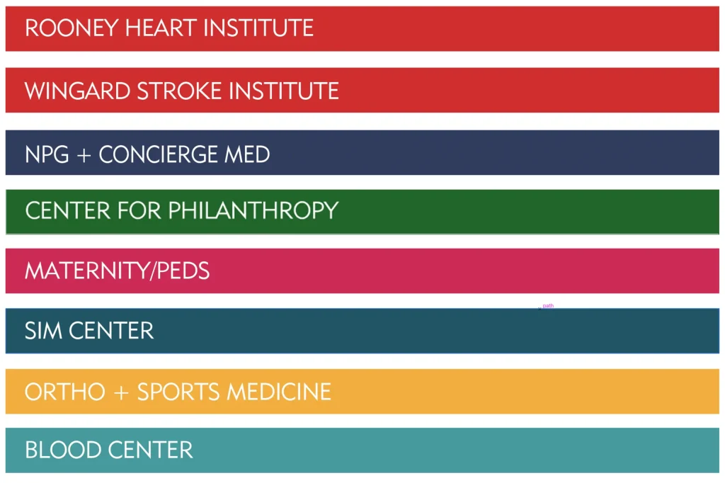
Excellent logo design doesn’t work if designed in a creative vacuum. Our team considered all applications of where and how the brand will display, how it will be used in physical and digital environments and how it extends into services lines, physician groups and strategic partnerships. Different service lines were assigned certain colors from the palette and sub brand logos created.
Brand architecture diagram
The new brand represents a modern, dynamic image that embodies NCH’s vision for the future of healthcare. The updated design features a bold, vibrant color palette, and a stylized “NCH” that conveys the organization’s sophistication while also giving a nod to its past.
The effort that went into this identity design is proof that developing an attractive and informative brand identity is more than just logo design. It demonstrates how a strong brand can help differentiate from competitors, build trust with patients, make them feel like they are in good hands, and improve overall patient outcomes.
Your patients expect the best, and your brand should reflect that. From hospital networks and medical systems to private practices, The Partnership is a fully integrated PR, Marketing and Communication agency that works side‑by‑side with healthcare organizations in Atlanta, Tampa, and Southwest Florida, to deliver comprehensive marketing strategies. Whether you’re launching a new service, managing a challenge, or looking to boost visibility, we’ll guide you every step of the way. Get in touch and let’s create a marketing plan that gets results.
Watch the rebranding video of the System of Naples Comprehensive Health (NCH) in Naples, FL and see how our healthcare marketing team transformed their brand to better connect with patients and the community. Discover the strategies behind their refreshed brand identity and learn how we can help your healthcare organization achieve similar results.
A new element. A stronger Alloy.
The Partnership is now part of Alloy. We’re still the same team you know, now working with more people who share our love of great work. Together, we’re already taking on bigger challenges and getting even better results.